Project title: Knowledge integration and Management Strategy Evaluation modelling
Program: Kimberley Marine Research Program
Modelling the future of the Kimberley region
Scenario Analysis (Ecosim) - Summary Results
Ecosim is the non-spatially explicit component of EwE which models the time dynamic evolution of the marine ecosystem. It shows us how the marine food web responds to different levels of pressure. These results are important not only because they reveal how different components of the food web interact during the system evolution, but also because this understanding is then ported into the spatially-explicit component of EwE: Ecospace. Here we summarise the main insights obtained by the analysis of the Ecosim results.
The state of the Kimblery marine environment in 2050
Figure 1 shows the box plot of the state (x axis) of all indicators (y axis) at the end of the Ecosim simulations (2050) aggregated over all 18 modelled scenarios. The values are expressed as a ratio of change over the value at the beginning of the simulation (2015). Values <0 (>0) imply decrease (increase) in biomass over the simulated timespan. For each indicator, the thick black vertical line represents the median of the distribution of the values over the 18 scenarios and the thick bar shows the interval between the first and third quantile. The thin line gives a fuller representation of the overall distribution.
By analysing the location and width of these distributions, indicators were grouped according to their responses to the 18 different modelled scenarios. In particular, we focus on the results of four groups:
- Winners: these are the indicators for which the distribution lays completely to the right hand side of the dashed “no change” line in Figure 6 , implying that biomass changes are >0 for all scenarios. These include seagrass and, as a result, turtles and dugongs who feed on it.
- Losers: these are the indicators for which the distribution lays completely to the left hand side of the “no change” line in Figure 6 , implying that biomass changes are <0 for all scenarios. These include target species, corals, snubfin dolphins and pelagic sharks.
- Low scenario-sensitivity: the groups whose final biomass is not much affected by the different scenarios, as shown by a narrow boxplot. These include: mangroves, corals, snubfin dolphins and mammals. These groups may be winners, losers or show little change at all, the important consistent feature is that their biomasses converge to a particular level regardless of what else is occurring in the system; and
- High scenario-sensitivity: the groups whose final biomass is significantly affected by the different scenarios, as shown by a wide boxplot. These include: seagrass, turtles and seabirds.
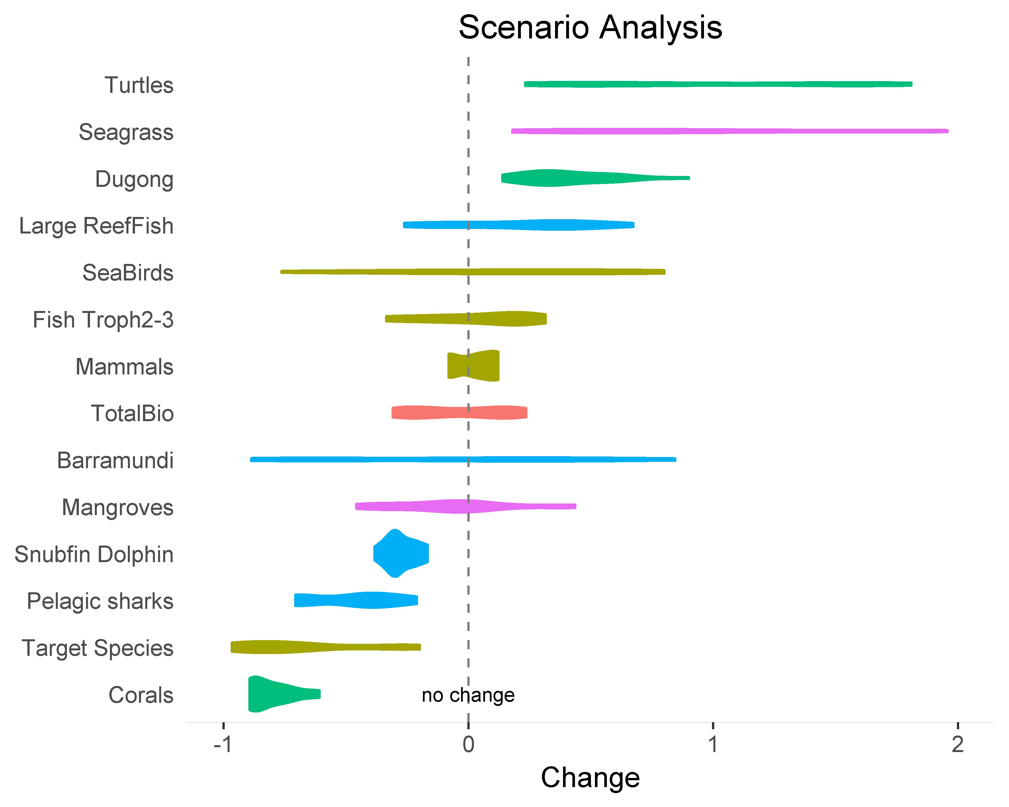 |
| Figure 2. Violin plot of the state of all indicators (y axis) at the end of Ecosim simulation (2050), expressed as ratio of change in biomass over the value at the beginning of the simulation (2015). For each indicator, the violin plot summarises the distribution of the end states. |
Figure 1 shows the distribution of biomass changes as a function of the modelled scenarios, without specifying how the scenarios affect an indicator’s distribution. The latter is shown in Figure 2 . Here, for each scenario, the bars map the change in biomass as departure from the median shown in Figure 1 . For each of the 3*3 scenario, the pink/blue bars represent the dry (low precipitation) and wet (high precipitation) conditions, respectively. To simplify the analysis of the figure, only indicators whose final states change more than 40% compared to the median are included in this plot. The plot shows clearly the effect of the climate forcing in terms of warming, since the bars on the top row (High Climate Change) are mostly on the left hand side (<0) of the panels, while the bars on the bottom row (Low Climate Change) are all on the right hand side (>0) of the panels. The plot also shows the forcing due to the precipitation regimes, in particular in the middle row (Medium Climate Change) with the pink and blue bars pointing in opposite directions. On the contrary, the forcing due to socio-economic development is less clear.
Bar plots of biomass changes for each indicator are available here, where bar plots for each of the 59 functional groups in the EwE food web can also be found
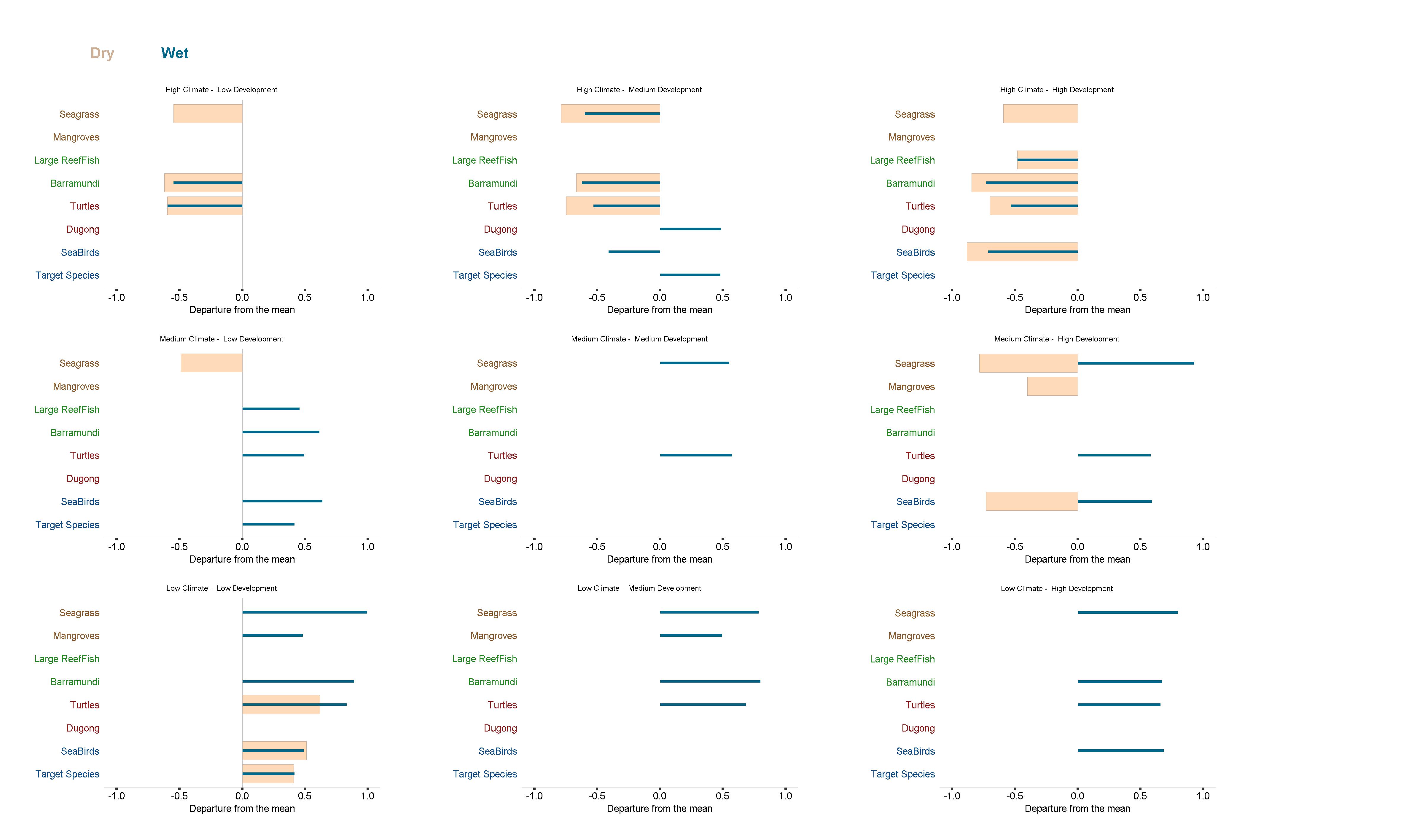 |
| Figure 2. Bar plot of the state of all indicators (y axis) at the end of Ecosim simulation (2050), expressed as ratio of change over the value at the beginning of the simulation (2015). Only indicators whose final state change more than 40% compared to the mean shown in Figure 1 are included in this plot. Click here to view a larger figure |
Sensitivity analysis
In any modelling study it is essential to carry out an assessment of the model sensitivity to different parameters as well as to different model components (system structure). On the other hand, in models as complex as EwE, with 59 spatially distributed functional groups, a careful serial numerical analysis of the impact on each model parameter is computationally infeasible wit current computing capacity. Fortunately, EwE provides two tools which help obtain a simplified model sensitivity analysis.
The first tool is provided by the computation of the ectotrophic efficiency in the Ecopath calibration step. Unrealistic values highlight functional groups whose parametrisation is unreliable. Second, parameters are assigned a pedigree (rank of reliability) as the Ecoapth model is developed and once Ecosim is parameterised and running, a Monte Carlo analysis of the impact of changing input parameters for each functional group can be carried out. These two results can be interpreted by an experienced EwE user to pinpoint the functional groups for which better and more reliable input parameters are likely to mostly affect the model performance. These represent the knowledge gaps to which priority should be assigned should an opportunity for further work be available. These functional groups are highlighted in yellow in Figure 3. As can be seen, these include mostly primary producers and finfish.
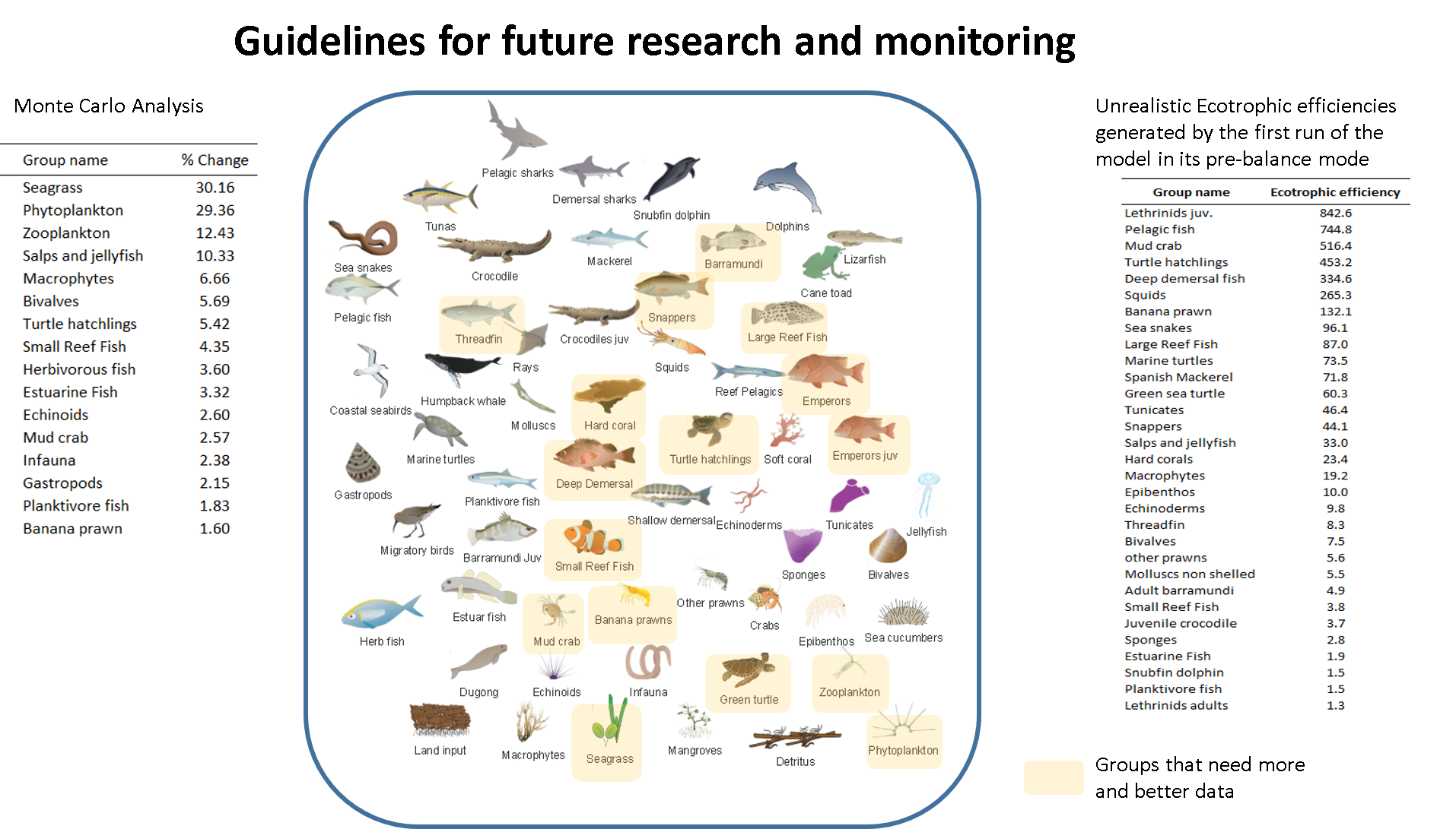 |
| Figure 2. Approximate sensitivity analysis on EwE. Highlighted in yellow in EwE food web are the function groups whose parameterisation is most uncertain and whose improvement can mostly affect the model reliability |
System evolution
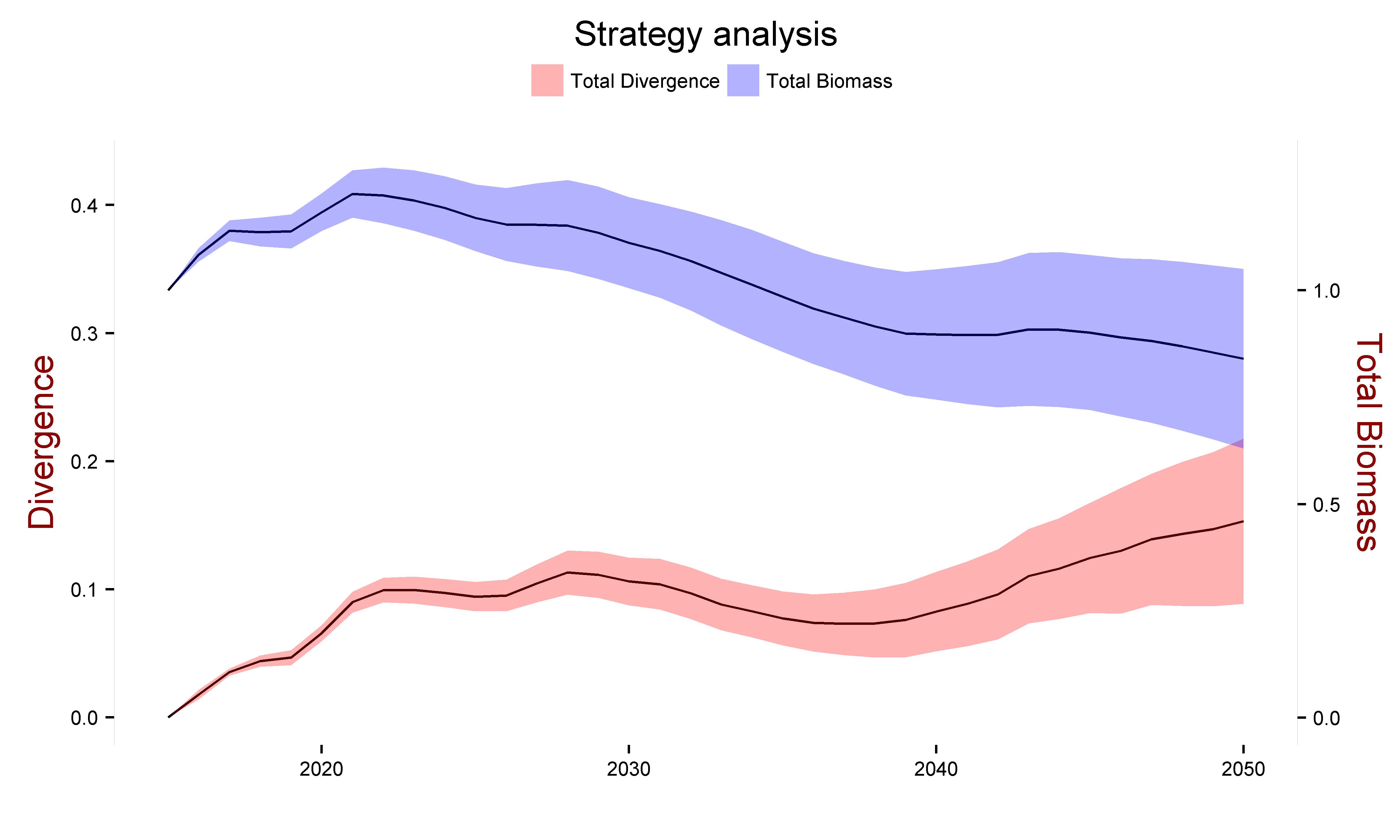
Figure 3 a shows the ribbon time series of three system level indicators, the Divergence and Total Divergence (Y axis on the left) and Total biomass (Y axis on the right). The meaning of these indicators is explained in Section 10 above. We include this plot to show how the Total Divergence (pink) captures features of both Divergence (green) and Total biomass (blue), as it was designed to do. The Divergence measure (green) naturally start at zero (left Y axis) and oscillate during the simulation. The total biomass (blue, right Y axis) naturally starts at one (since it is a relative biomass measure), departs from one early in the simulation and slowly returns to values close to one in the later part of the simulation. The Total Divergence (pink) roughly follows the oscillatory behaviour of the Divergence (green) but shows a smaller departure from the original system in the later part of the simulation, reflecting the role of the Total biomass.
 |
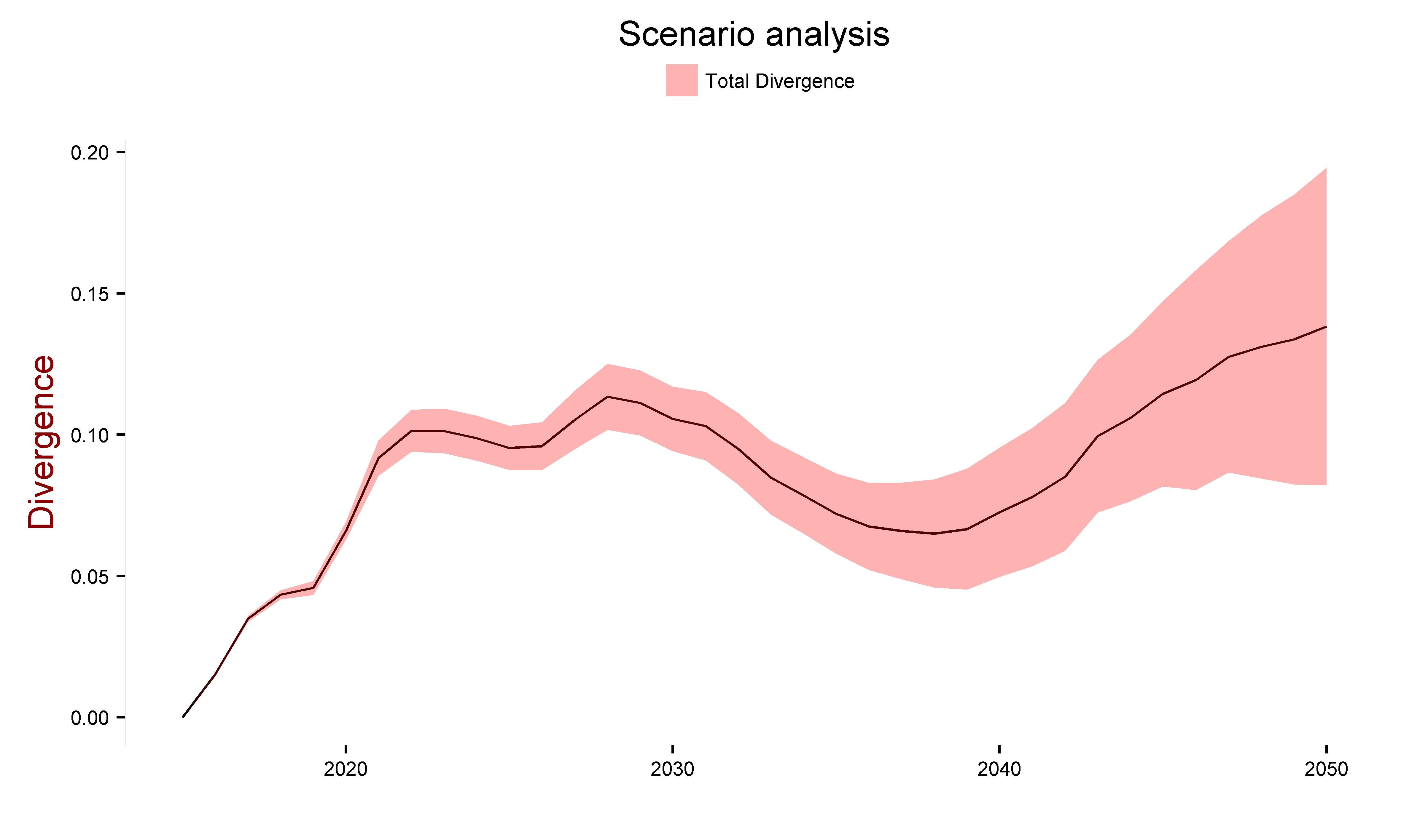 |
| Figure 3. (left) Ribbon time series of the Divergence and Total Divergence (Y axis on the left) and Total biomass (Y axis on the right). Divergence indicators measure the difference between the state of the system in each year (X axis) and the system at simulation start (2015). Total biomass shows the ratio of the biomass change over the total biomass at simulation start. The dark lines show the mean of the indicators over all scenarios. The ribbons show the standard deviation over all scenarios. (right) Ribbon time series of the Divergence and Total Divergence, enlarged for easier visual analysis | |
Because we are satisfied that the Total Divergence captures the overall change in system state during the simulation, we focussed the rest of the analysis on this measure. For clearer visual inspection, we show and enlarged plot of the time evolution of the Total Divergence in Figure 8b. Two features are particularly significant:
- There is a clear oscillatory behaviour in this indicator, with a period of ~25 years, to which a possible secondary oscillation of period ~10 year is superimposed; and
- The variance (pink ribbon) over the mean (dark line) is fairly narrow. By this we mean that the variance itself does not obscure the general oscillatory behaviour of this indicator.
The previous point suggests that the 18 modelled scenarios have some impact on this indicator but not such to obscure its overall dynamics. It follows that this oscillatory behaviour appears to be a feature of the system’s internal dynamics, as opposed to a feature of the forcing (scenarios) on the system.
Numerical analysis of EwE output (not shown) suggests that this dynamics is largely controlled by primary producers. Because the parameterisation of primary producers in EwE is partly uncertain, it follows that some details in Figure 4b are also uncertain. For example, the timing of the oscillations described above should not be overanalysed for management purposes, since they may be sensitive to model parameterisation. Rather, we should interpret Figure 4b as showing that the system is likely to undergo strong oscillatory behaviour due purely to internal processes and that these deserve further analysis. For example, it is often assumed that large changes in biomass distribution over a food web may affect its stability and resilience to pressure. If this is true, then Figure 8b suggests that the system response to natural or man-made hazards (storms, oil spills, bleaching) may depend on the timing of these events. This is particularly significant in relation to the recently developed concept of ‘perfect storm’ (Dearing et al. 2012), which addresses how several pressures, each of which in isolation may not be able to significantly affect a system, may do so if their timing results in a cumulative alignment of the combined pressures. This adds a further concern (timing on a threat) to management planning which we suggest deserves further consideration.
Scenario Clustering
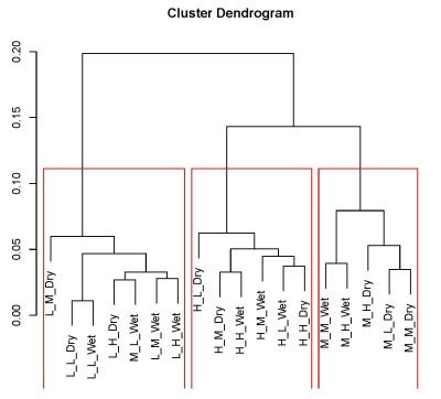
The Total Divergence can be used not only to study the system’s dynamical evolution but also as a measure of the difference among the end states of all simulated scenarios. In turns, these differences can be used to explore whether natural groupings in these scenario outputs exist, via cluster analysis. Figure 4a shows the result of the hierarchical clustering applied to the 18 scenarios. The cluster dendrogram suggests that the scenarios can be grouped into 3 clusters, which are visualised in Figure 4b.
 |
 |
| Figure 4. Result of the hierarchical clustering applied to the 18 scenarios in Figure 4 (3 climate scenarios * 3 development * 2 precipitation regimes). (left) The cluster dendrogram suggests that the scenarios can be grouped into 3 clusters. (right) Mapping the 3 clusters over the Future’s plane clearly shows how the scenario clusters are controlled mainly by climate forcing in terms of warming | |
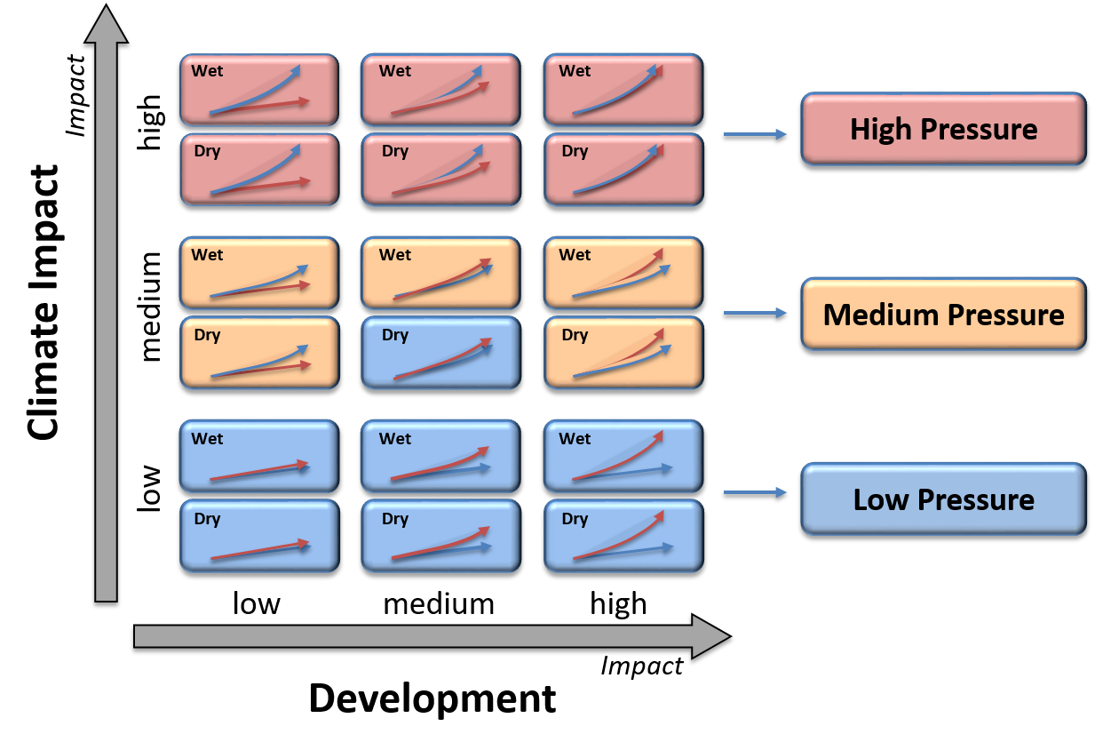
Figure 4b confirms the tentative ranking of system pressures. The distribution of the clusters over the Futures plane clearly shows how these are controlled mainly by climate forcing in terms of warming (Y axis). Within this main layering, forcing due to the precipitation regimes affects the middle cluster by assigning the Medium Climate - Medium Development - Dry Precipitation scenario to the Low Climate cluster. Forcing due to socio-economic development (X axis) does not affect the clusters. Figure 4b also shows that in order to simplify this work, analysis of the impact of the management strategies can be focusses on these three clusters rather than on the 18 original scenarios, as shown in the right hand side on Figure 11b. In the rest of this document, we selected one scenario to represent each cluster, which we will refer to as High, Medium and Low Pressure.
The cluster analysis in Figure 4 is based on the Total Divergence between the end states for each of the 18 scenarios; in other words, on the Total Divergence between the end states of each pair of modelled scenarios, resulting in a 18*18 matrix of values. In Figure 5, we show the Total Divergence between the end states for each of the 18 scenarios and the state of the system at the beginning of the simulations, resulting in a matrix of 6*3 values. Figure 5 tells us how much the state of the system changes during the simulation, for each scenario. Figure 12 can be understood as a low dimensional projection of Figure 4. As a result, it contains less information and should be interpreted as a coarse approximation of Figure 4. We show it here because it reinforces the message that warming, precipitation regime and development have impact of different magnitude on the system state. In addition, by focussing on the ‘high’ climate change scenarios on the top row, Figure 4 also shows that climate and development impact do interact significantly. The end state of the system under ‘high climate – high development’ scenarios (wet and dry) are more different from the system in its 2015 state than both ‘high climate - low development’ and the ‘low climate - high development’. In other words, while development impacts are overall less significant that climate impacts, their interaction with climate can become significant when the system is already under climate stress and should not be ignored
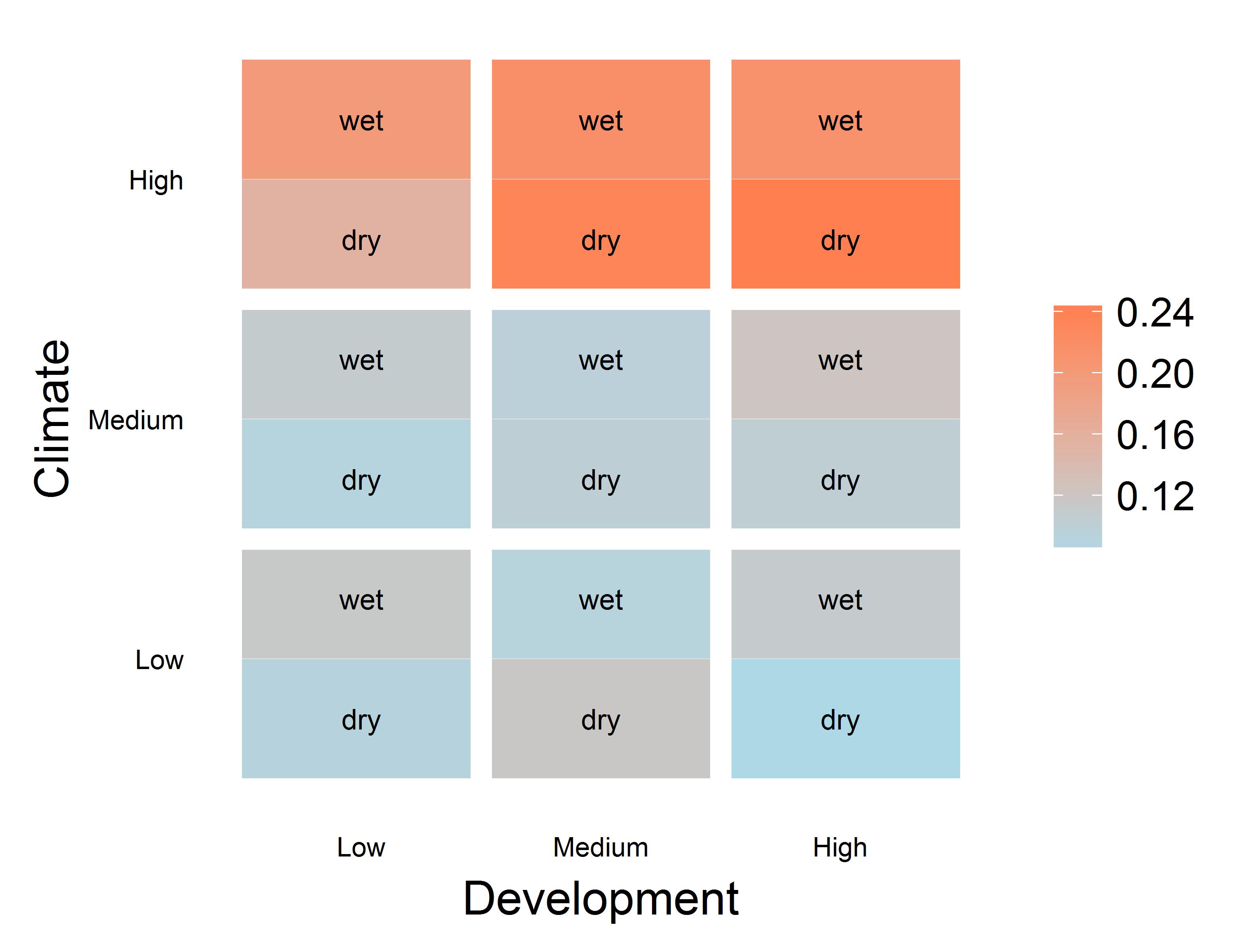 |
| Figure 5. Total Divergence between the end states for each of the 18 scenarios and the state of the system, at the beginning of the simulations. |