Project title: Knowledge integration and Management Strategy Evaluation modelling
Program: Kimberley Marine Research Program
Modelling the future of the Kimberley region
EwE visualisation
In this work, we followed the guidelines suggested in [1] to visualise the EwE results. In a few words, these guidelines suggest to
- maximise the amount of information included in a figure, rather than oversimplifying it and
- avoid information overload by adopting a minimalistic design. In particular we adopt three types of visualisations including time series, barplots and boxplots as described in the table below
| Visualisation type | Example | How to read it |
| Time series of a single indicator/species for a specific scenario | 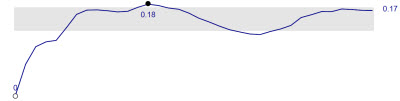 |
Evolution of a variable over time. Rather than including a Y axis to show the value of the time series, only the minimum (white dot), maximum (dark dot) and last value are shown. The grey ribbon shows the interval containing 50% of the time series values. It helps focussing on the core feature of the time series by removing most details of minor significance. |
| Time series of a one or more indicator/species showing mean and standard deviation over all scenarios | 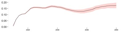 |
At each point in the X axis, it shows the mean (black line) and the standard deviation (ribbon) of the distribution of time series. |
| Violin plot: state of an indicator/species at the end of the simulation (2050) for all scenarios | 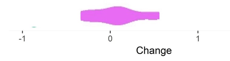 |
Distribution of values of a variable. It is similar to a box plot, except that it gives an indication of the probability density of the data at different values. For each point on the X axis, it shows the probability of value occurring in the distribution |
| Bar plot of states of an indicator/species at the end of the simulation (2050) for a specific scenario | 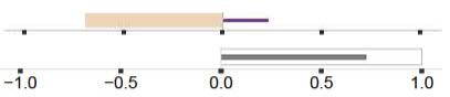 |
Rate of change of variable (e.g., biomass at the end of a simulation), relative to a reference baseline, as (biomass-baseline)/baseline. Positive (negative) values mean the variable increased (decreased). We use two different colour sets: |